1. D3.js Visualizations
1.1 Self-made visualization 1, Monthly Bar Chart SVGs
Features:
- Color mapping for cold (blue) and warm (red) temperatures, as well as missing data (yellow).
- Resizing of bar width and font-sizes depending on SVG dimensions.
- Horizontal spacing of grid lines and x-axis labels depending on the size of the dataset.
- Conversion of arbitrary space separated values to comma separated values for usage in D3.js is done on the fly. No pre-processing necessary and allows direct-linking of remote dataset (which is not used here, this is a self contained version).
1.2 Self-made visualization 2, Overall Heatmap Table
Features:
- Color mapping for cold (blue) and warm (red) temperatures, as well as missing data (yellow).
- Visualization only uses HTML Table elements, but looks like a heatmap.
- This was actually done as a test on the way to the bar charts above, but it looked quite nice and more holistic, so it was included as well.
1.3 Visualization using third party library dimple.js
2. How has the weather changed over the past 100 years?
2.1 Motivation
Climate change and the effects of human activity on it are still heavily discussed - mostly not between scientists that is, but between political opponents in countries like the USA. Data visualization is a way that can bring the research results from the meterorologic labs straight to the wider public.
Here our main motivation is to find out how the temperatures have changed during the last century and therefore we would like to get some meaningful answers to the following questions:
- Which year was the hottest one? What about the coldest one?
- Have there been any extreme changes from one year to another?
- Is there a steady rise in temperatures? So should we be concerned about global warming?
- Are there any noticeable trends or patterns in the average temperature variations?
2.2 Method
We used data provided by NASAs Goddard Institute for Space Studies as part of the GISS Surface Temperature Analysis. The data was adjusted for homogeneity "based on night light radiance data" by the GISS (source). We selected the stations Ankara (Turkey), Copenhagen (Denmark), Hamburg (Germany), Turku (Finland), Sodankylä (Finland) and Sydney (Australia) because they were close to personally significant places for the authors (as given in the task).
Since the original data is saved in a file where the values are separated by an arbitrary amount of spaces, we had the choice to either convert the data first into an easier readable format, or to write an own conversion method in JavaScript. We decided for the latter for the simple reason, that we do not have to pre-process the data before using it. This enables us to link directly into the source file and offers the possibility to let the user use any weather data with our visualization he desires.
We visualized the data as a series of bar plots, each showing the average temperatures of a single month over the available years. The bars are color-coded, where blue indicates relative coldness, red warmness and yellow indicates missing data. We also visualized it as a heatmap showing each month of a year in a table row, using the same color coding as before. This was done using only d3js and jQuery.
The third graph was developed using dimple.js as a third-party library. It shows each available month per year as a circle, while the bar chart shows the average over all months of the year. Exact data is available on mouseover.
2.3 Results & Discussion
In the visualizations we can see a slight overall increase in temperatures for most of the months and most measurement stations. However, the significance of this increase is questionable, since the temperatures are subject to a rather high variance. The heat map shows that the warmer months are slightly increasing the further down, i.e. into the more recent years, we go.
The coldest years on average were often a few decades ago, while the hottest years were in the more recent past. In the case of Ankara the coldest year was 1976. The hottest year on average in Ankara was 2010. Other than this, we were not able to see a significant increase in extremes between years.
Additionally, we had the impression that the temperatures measured within a year and on average are fluctuating every 5-8 years. This can be seen all visualizations and is expressed by a slight wave pattern.
One should note that the temperature alone is not a sufficient indicator for climate change or change of weather conditions in general, since this change can manifest in multiple different ways. For example, there might be an increase in natural phenomena, or even catastrophes, such as storms, floods, forest fires, etc.
Additionally most datasets have missing data. At this time we did not perform any smoothing or regression to fill in missing data points, which causes some problems with statistical calculations. As a result, these calculations have been omitted. In a future version we would at least plot an additional linear regression function to show the actual overall increase in temperature. A polynomial regression would be desired as well, as it may show the exact patterns of the fluctuations mentioned above. Currently the most accurate source of information are the exact values in the heat map table and the values shown by the interactive hover effect on the dimple.js visualization.
2.4 Conclusions
We can measure a slight increase in overall temperature. However, due to the missing measurements to take into account besides the temperature and the inclusion of missing data points, this result is not sufficient enough to answer the main question of this article.
3. Individual Parts
3.1 Bogdan
Which data set and visualization would you include to give a more confident answer to the articles main question?
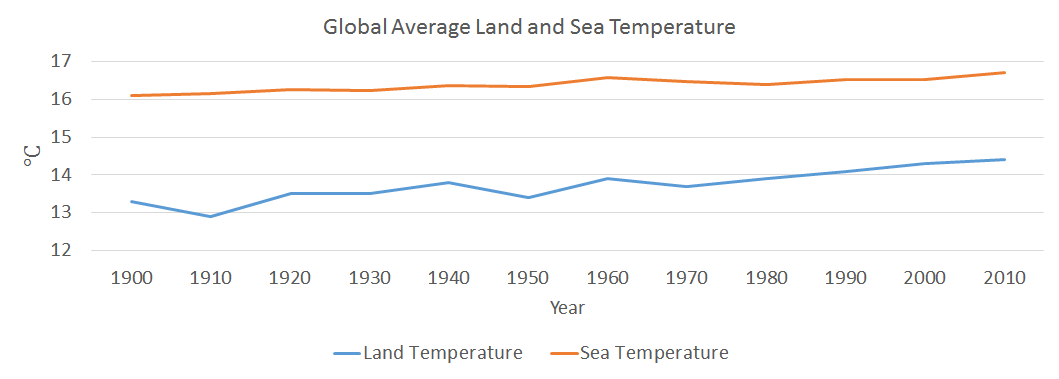
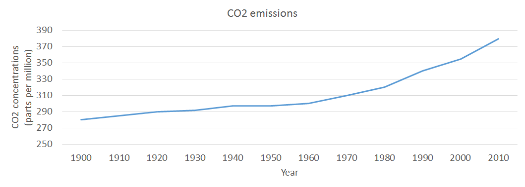
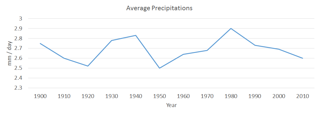
One good idea could be to compare the average temperatures, during the last century, with the level of precipitations, the average temperature of sea / oceans and also the level of CO2 emissions. Therefore, there is the possibility of finding out if there is any correlation between those elements and on top of that if there is any pattern followed by all four measured elements.
Mockups
3.2 Hauke
Which dynamic elements or interactions could improve your article?
As of right now the data can still be "overwhelming" for the user. We have a bunch of different bar charts which do not fit on most screens at once and make it hard to compare the temperature changes between months. Interactivity could help here, for example in the plot shown in 1.3 when the user moves the cursor over a certain month datapoint a line connecting this month in each respective year could be drawn.
As we are handling historic, time-based data, the user could be given the opporutinity to set the speed of an animation, that shows the changes in temperature as time moves on. The user could also use a slider to navigate through the years.
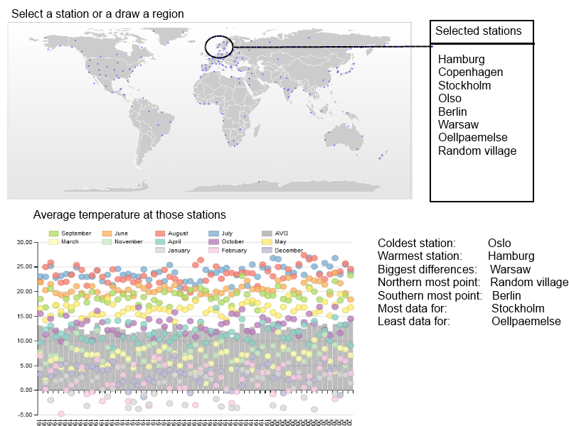
A totally different interactive visualization could be done if datasets from all available stations would be loaded, together with the geo-positon of the station. The user could select on a world map either one station or mark a region (draw a rectangle/circle/free-hand) and then see the averaged values of all those stations in one diagram.
Mockups
3.3 Marco
How big data sets are reasonable to load in d3 visualizations?
In order to answer these questions, I’d like to separate the problem into technical and practical issues that arise with certain sizes of data sets.
From the technical perspective, we have to consider that JavaScript is executed on the client side. Therefore, the amount of data the client can handle depends on the machine running the client, as well as the client and its JavaScript engine itself. This especially holds if tje dataset consists of a very large amount of data points, or if the data set is used in a visualization which requires a lot of calculations, e.g. graphically demanding visualizations.
From the practical perspective, the most important issue is that the user is not getting lost in a huge amount of data points. Again, this highly depends on the visualization itself. For instance, a scatterplot can display a huge amount of data points and the user can still see clusters or regressions. However, if the regression is plotted as well, the data-points may obscure the visibility of the regression line.
What types of visualizations does a limit like that exclude?
This limitation excludes data that is very large considering the size in memory, e.g. image or video data. Data sets that include a vast amount of features, e.g. Markov chains of huge textual datasets.
Additionally, raw/unprocessed display of big data is excluded, which is often not particularly useful anyway.
Give examples of visualizations that must be based on large data sets and discuss how they deal with this.
I was unable to find examples at this time. Perhaps my understanding of what constitutes a large dataset is too restrictive. However, following I am describing techniques that can help with the issue of large data sets.
One can deal with large data sets in different ways. One way of doing it is to reduce the size of the data sets as a pre-processing step. This can be done by sampling or by convolution.
The sampling method can vary vastly, so the choice is important. If the data itself is very similar, the sampling method may be very simple and choose every n-th data point. If the choice of data points can have a bigger impact on the meaning of the data, one has to choose a more sophisticated method, taking into account the properties of the dataset. This can be done by some machine learning methods, such as Principle Component Analysis (PCA), or and method that provides feature reduction. If only a certain part of the data is important, one could simply focus on this particular part and visually hint that there is more, but this part is the most important.
Equally important is the choice for a convolution method. A simple example would be to calculate the mean over several data points, thus reduce the size by a factor equal to the number of data points included in the new mean value.
Another way of dealing with visualizations of huge data sets is to use non-interactive visualizations and render them into pixel graphics or even videos. This task can be done by high performance systems. Contrary to vector graphics, which still require the client to render each element, pixel graphics do not require much effort to be displayed. Unfortunately, they cannot be enlarged without quality loss.
Could you have reduced the size of the data sets in this assignment?
Yes, and actually the NASA already did exactly this in their own visualizations. They have calculated the mean of the temperatures for each year, and in the dataset itself even for each season. However, for this assignment only the mean did not seem very enlightening and the sizes of the data sets were quite manageable, so that we could process the monthly data on the fly.