1. Web-Server Limitations
| Free Disk Quota | ca. 80GB |
| Traffic Limit | None / Unlimited |
| Other Features | PHP 5.5 (incl. Imagick Module) & MySQL |
2. Interactive Visualizations
2.1 Google Public Data
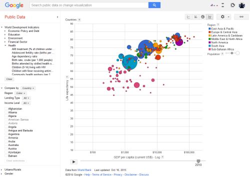 google.com/publicdata
Description
The diagram shows each country as a circle, where the size of the circle corresponds to the size of its population, the position on the x-axis corresponds to the life expectancy, and the position on the y-axis corresponds to the fertility rate. The data corresponding to the axes can be freely chosen among all data that is available in the World Bank. The time progression over the years is additionally shown as an animation. Additionally, the circles are color coded by continent.
In this particular example most of the countries have moved towards the bottom right corner of the diagram over time, which signifies that the fertility rate dropped and the life expectancy raised.
The visualization tool Gapminder.org shows the same visualization developed by Hans Rosling and his team. In an older version of this tool it was further possible to separate the circles on click into their respective regions or provinces.
Positive and Negative Aspects
- Positive
- Lots of features in one visualization: data for both axes, population size as bubble size, continent by color code, and time progression by interactive slider or animation.
- On mouse-over, information for each country is shown.
- There is the possibility to show only countries from a specific region (i.e. filtering).
- Countries can be compared based on a number of different values, e.g. the income level, gender or urban/rural areas.
- The chart is showing the data over time progression.
- There are 4 different chart types (Line Chart, Bar Chart, Map Chart, Bubble Chart), which can be used to visualize the data.
- Scaling of the data can be chosen between linear and logarithmic.
- Vast number of options for the axes, based on information of the World Bank
- Option to show the trails in the animation to clearly show the development over time.
- Possibility to upload own datasets to explore.
- Negative
- Number of options can be overwhelming.
2.2 World's Top Arms Exporters 2013
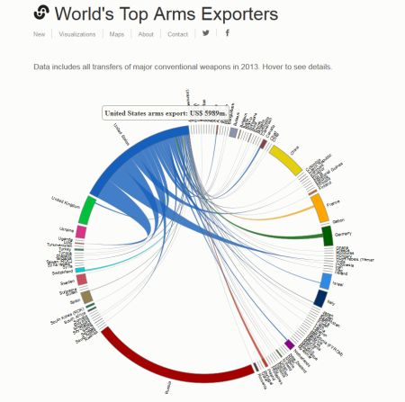 insightfulinteraction.com
Description
This chord diagram shows the origin and destination countries of weapon exports in 2013. It was developed by Natalia Bronshtein using d3.js and is based on data from the SIPRI Arms Transfers Database. The work is licensed under the Creative Commons Attribution 4.0 International License.
The diagram lists countries (or fighting factions) alphabetically on the outside of a circle and shows connections between weapon exporter and importer, where the volume of the export in $USD is indicated by the thickness of the connection at its base at the exporting country.
Positive and Negative Aspects
- Positive
- Diagram type suited to show volume of many-to-many relationships
- More detailed information is available on mouseover
- Countries are listed alphabetically and therefore easier to find
- Negative
- Countries are listed alphabetically, no visual indication of export volume by order
- Lacks of drill down functionality especially for small weapon exporters
- The visualizaton does not show the share of a country of the total weapon imports of a customer country. There is another visualization which shows the imports
2.3 Inside Institutional Networks
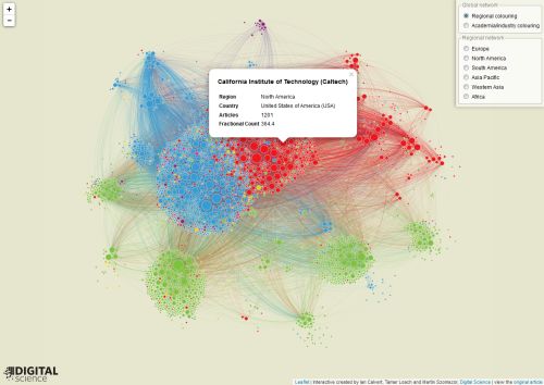 nature.com
Description
This network diagram shows the collaboration between research institutions. Institutions who published papers in journals that are tracked by the Nature Index are the nodes. The volume of a node is determined by the research output and the clustering is based on the research output and the connections to other institutions. The thicker the connection to another institution is the more papers were published together. The color marks either the geographical region or the type of the institution (industry or university research).
The user has the posibility to select and display subsets by geography and change the coloring to either indicate the type of the instituion or the region.
The visualization was developed by Ian Calvert, Tamar Loach and Martin Szomszor of Digital Science using the leaflet JavaScript library.
Positive and Negative Aspects
- Positive
- Clustering and color makes general pattern recognition easy
- More detailed information is available on mouseclick
- Subset selection allows to drill down up to a certain level
- Negative
- Hard to find individual institutes
- Selection of multiple-subsets (North-American and European institutions or industry research institutions in Pacific Asia) is not possible
- Clicking on each node is tedious (in comparison to mouseover with a small time interval)
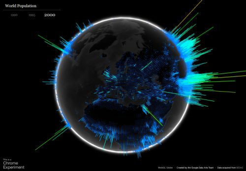
2.4 WebGL Globe - World Population
 globe.chromeexperiments.com
webgl-globe@GitHub
globe.chromeexperiments.com
webgl-globe@GitHub
Description
This visualization is displaying the worlds population for every approximately equally sized geographical chunk of the globe. The data can be selected for three different years: 1990, 1995, and 2000. The globe is rendered via WebGL and three.js, which allows the user to rotate the globe by dragging it with a mouse or the like.
Positive and Negative Aspects
- Positive
- Very good looking visuals.
- Can be rotated to any point.
- Rotation supports inertia effect.
- Changing the data has an animated transition and does not abruptly change the visuals.
- Project is open source and can be used with own data.
- Negative
- The changes of the data is not making a big difference.
- The bin size (size of the geographical chunks) is fixed.
- There is no zoom function to get a closer look at particular areas.
3. Individual Parts
3.1 Bogdan
3.1.1 Description
My idea of an interactive visualization, I would like to build after this course has finished, is a Köppen–Geiger climate classification system. Even though the data visualized is not very impressive, I believe that this interactive map chart would be utterly useful for students, who are interestied in learning the climate zones in an interactive way.
3.1.2 What should the accompanying text say about the visualization?
The accompanying text will shortly describe the climate classification groups
3.1.3 What story would the combination of text and visualization tell?
The combination of text and visualization would tell how the climate areas are positioned on the world map, what are the main characteristics of each climate zone and how do they resemble to each other.
3.1.4 Who is the intended audience?
The intended audience are students who are interested in geography and are willing to learn about the climate areas in an interactive way.
3.1.5 Where would you get the dataset from?
I will get the dataset used for the interactive visualization from Center for International Development at Harvard University.
3.1.6 A sketch or mockup of the visualization.
In general, the map chart will look like the one below, where there is the possibility to select one of the continents for a better insight view. On mouseover, each climate area will provide additional information about that climate zone.

3.2 Hauke
3.2.1 Premise
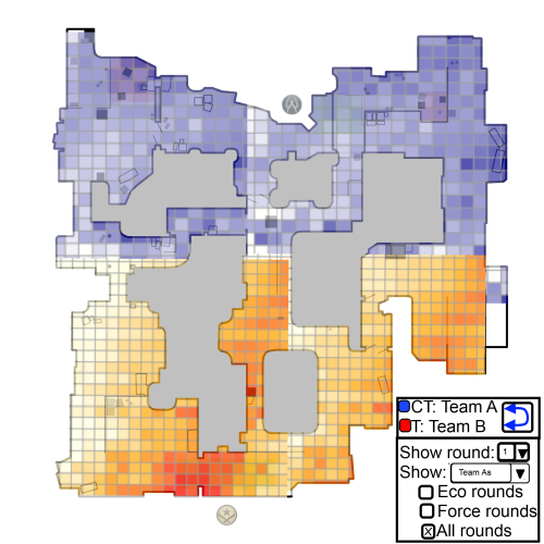
I would like to visualize data from the matches of professional Counter Strike: Global Offensive teams. Every match is recorded as a so called demo. Analysing those demo files from a tactical standpoint could help teams to figure out counter tactics in preparation for a match, identifying their opponents favourite and most effective spots on a heatmap of the game world.
3.2.2 Who is the intended audience?
The intended audience are (professional) Counter Strike players, coaches, e-sport commentators or anyone who wants to show the play style of a team.
3.2.3 What should the accompanying text say about the visualization?
The accompanying text should explain the possiblities the user has in interacting with the visualization. As of now I plan to enable users to upload their own demos and to let them analyse them using the visualization tools I provide. This also affects the next section:
3.2.4 What story would the combination of text and visualization tell?
There are many stories the visualization can tell if I enable users to analyse their own demos. I think this would provide the most gain for the users. If that is not within the guidelines of this class I can also use this system to get the "static" interactive visualization of just one professional, high-profile Counter-Strike: Global Offensive match and provide more "static" texts hinting the user to interesting properties of each teams play style in that particular match.
The interactive elements should allow the user to select different sets of the up to 30 rounds per game. There are "economy-rounds" ("eco") in which one of the teams didn't have enough money at the start to buy rifles, "force" rounds, where the teams doesn't have enough money to fully equip and "full-buy" rounds. Depending on their equipment I expect professional team to adapt their tactic which should be visible on the heatmap. These are the stories I want to tell.
3.2.5 Where would you get the dataset from?
Demos of official professional matches are publicly available. There are libraries that extract events (like "weapon fired", "bomb planted") from demo files which can be visualized. Examples are jsgo for node.js and the official Demoinfogo in C++.
3.2.6 A sketch or mockup of the visualization.
3.3 Marco
3.3.1 Premise
I do not have a definite data set at this moment. Therefore, the current idea is only tentative. It is quite difficult to think about a visualization without knowing the exact features of the data I will get.
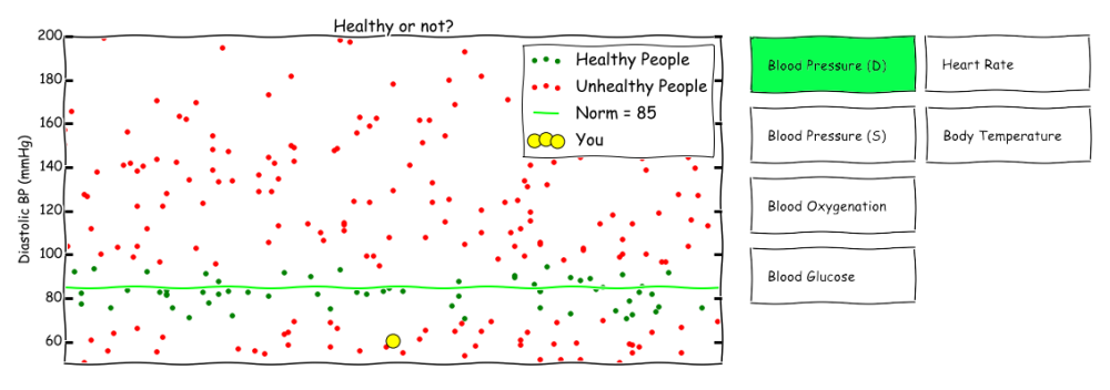
I am using the following scenario as a premise: I would like to get a dataset of measurements done by healthcare professionals or individuals with access to equipment in order to make their own measurements (e.g. blood pressure, blood glucose, body temperature, oxygenation, heart rate, etc.). Additionally, there should be some labels available, which show the current health status of the corresponding (e.g. healthy, experiencing symptom X or ill with a specific disease Y).3.3.2 What should the accompanying text say about the visualization?
The accompanying text should explain how to interpret the visualization and explain the controls, i.e. the interactive elements of the visualization. The interactivity could be switching between different types of measurements. At a later stage, the visualization could “follow” the development of the measurements for one specific individual.
3.3.3 What story would the combination of text and visualization tell?
The combination of text and visualization would tell how to see correlations between the measurements and the health status of the user, and in the future the trend or development for a specific user over time. It would be used to find correlations or to simply show the current estimation (or prediction) of the user’s health.
3.3.4 Who is the intended audience?
The intended audience are health professionals and users who are interested in an indicator for their health based on their measurements.
3.3.5 Where would you get the dataset from?
Healthcare facilities/departments or lifelogging communities. However, healthcare facilities have often rigorous non-disclosure requirements and rules for anonymization of data, which might cause a time issue. Lifelogging enthusiasts are often more willing to offer their data with the prospect of gaining some insight. Furthermore, their data often includes relevant data, as they collect a vast number of information. Unfortunately, their data may be quite sparse or “dirty”, i.e. the measurements may be very infrequent and have missing or wrong information.
3.3.6 A sketch or mockup of the visualization.